Showing posts with label mary blair. Show all posts

Thursday, August 13, 2009

Mary Blair, part 4


In addition to her brilliant children's book ilustrations and an illustrious career with Disney, Mary Blair did animation and ad design for Nabisco, Meadow Gold, Maxwell House, and others. In fact, Blair designed a huge Meadow Gold campaign using the actual characters from I Can Fly! Here's an animated TV commercial from the campaign. The voices are hilarious.

Tuesday, July 28, 2009

Mary Blair, part 3


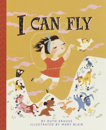
As promised, here are some of my favorite illustrations from I Can Fly, written by Ruth Krauss and illustrated by the venerable Mary Blair. Published in 1951, I Can Fly has never been out of print! You can see why.


Saturday, July 11, 2009

Mary Blair, part 2


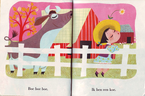
Disney buffs might beg to differ, but I think Mary Blair's most beautiful and inventive images are her children's book illustrations. Blair's gift for color and composition are so evident in these clever designs (for example, in Little Verses, Baby's House, and--the sole subject of next week's third Mary Blair post--I Can Fly). Above: a spectacular spread from Little Verses. The flat planes of brilliant saturated color work as well as they do here because of the smart composition and the striking forms.

Below: two more pages from Little Verses. The illustration on the left is so imaginative and sweetly ornamental, with the floral forms and the bumblebees forming patterns of their own without stealing focus from the central character, a cherry blossom tree. And the illustration on the right is such a pleasure to look at because Blair has engineered movement into the composition; you eye knows exactly where to look, and when. With its focus on movement, this is one of those Mary Blair illustrations that reflects her many years of thinking like an animator (want to read a bit about her long and impressive career with Disney?).


Baby's House combines some of Blair's most decorative work with her unmistakable color style. With the exception of Paul Rand, no one does flat, geometric forms as beautifully as Mary Blair, and I think those qualities really stand out in BH. Below: cover design and two single-page illustrations from Baby's House. The image of Baby wrapped in a fuzzy towel is one of my favorite Blair illustrations because of the color contrasts, the patterning and skewed perspectives of the background elements, the shaping of the frame (it seems so spontaneous!), and, especially, of course, the gorgeous white space that creates the form of the towel. Just dazzling! And pure Mary Blair.


Next: if you've never seen Mary Blair's most celebrated children's book, I Can Fly, you're in for an unforgettable treat. My third Mary Blair post will be nothin' but ICF, a Little Golden Book so incredibly popular that, in the nearly sixty years since it was first published, it has never been out of print.

Tuesday, July 07, 2009

Mary Blair, part I

My girl Mary Blair, mention of whom you will find elsewhere
in the archives
, was an illustrator, animator, and commercial
artist known for her brilliant color designs. She illustrated
children's books, designed TV and print ads, and was a top
Disney artist.

Today's post focuses on Blair's work for Disney. During her
nearly forty-year relationship with the Disney company, Blair
created concept art and color styling for Cinderella, Alice in Wonderland, Peter Pan, and Song of the South. She also
designed Disney's It's a Small World attraction, and
was was one of Walt's favorite employees; he loved
her use of flat (but brilliant) color and her geometric
compositions, although they were difficult to translate into
Disney's more perspective-based animation style. Below are a
few concept drawings Blair did for Alice and Cinderella:


Left: early character designs for Cinderella.


Left and below: concept drawings for the marching cards, an oversized Alice, and the tea party from Alice in Wonderland.


These concept sketches give you a peek at Blair's genius for color. Among her many artistic gifts (including an amazing flair for creating beautiful compositions), I think it's really her talent for color design* that has brought about the enduring reverence of illustrators and animators all over the world. Even today, Blair's influence is evident in, for example, the abiding Disney palette.

Mary Blair was honored as a "Disney legend" in 1991, one of the first women to receive the honor.

I'll post three more Mary Blair posts in this series. We've still got her children's books and TV and print ads to look at!

Sources: Cartoon Modern, Animation Archive, Wikipedia, Sullivan Goss, this photoset on Flickr, this book, and this book.

* Allegedly, Blair was such a color enthusiast that she used to wear colored contact lenses -- blue, green, whatever matched her outfit. This was in the 1960s!

Tuesday, June 30, 2009

Thank you, Irvin Kerlan!


This morning I spent several hours looking, white-gloved, through boxes of original illustrations by some of my favorite children's book illustrators at the Kerlan. Theirs is one of the largest collections of children's book literature and illustrations in the world!

The pieces donated by Richard Scarry were my favorite. I've long admired his hilariously anthropomorphized watercolor-and-ink animals, and was really looking forward to seeing some of his original artwork today. What I found in the Richard Scarry boxes was a real treasure... no photos allowed, but I took mental snapshots of:

a) a "miscellaneous" (i.e. unpublished) painting featuring HUMANS! If you love Richard Scarry, you know that this is extremely rare! And...
b) a number of original, completed illustrations from Busy People. These really show Scarry's process. There were two layers to each image: watercolor on one sheet of paper, with ink line drawings on a transparent overlay. I noticed that he did all of his pencils with non-photo blue pencil. (An hour later, I was in the art supply store buying non-photo blue pencils.) AND...
c) An ink and watercolor book jacket study. It was for Tinker and Tanker out West (1961), a picture book I've yet to come across. The back of the jacket, featuring a few buffalo dressed in traditional Native American dress, had me in stitches. Scarry's mastery of visual gags is just unrivaled, you know?

I also pawed through a ton of Gustaf Tenggren's work. Tenggren was a classic Little Golden Books go-to illustrator during the Golden Age of the LGB.* And man, he did some great books, including The Tawny Scrawny Lion and, most famously, The Poky Little Puppy. Today I got the chance to look through all of the originals for The Poky Little Puppy, and that shit is beautiful! He even gave the Kerlan a few extra illustrations done for the book that didn't make it into the final picture book. I mean, Tenggren just drew that fkg puppy over and over and over and over.

Ooh, I also saw tons of Eric Carle originals! Nothing featuring the famously hungry caterpillar, but many beautiful cut-paper pieces from The Secret Birthday Wish. The back of one of those illustrations was scribbled with notes by Carle about how he'd had to repair the piece because he'd run into some archival issues. "I used to use rubber cement," he wrote, "but I didn't know that " " didn't last." The " " marks were beneath the words "rubber cement," to repeat them. Anyway, it was followed by the illustrator's revised glue recipe, which I can't remember. Something scientific-sounding + a bit of Elmer's glue, I think. Carle also wrote about how he stopped using "tinted" tissue papers, because the tint isn't lightfast, and began using only tissue paper painted with acrylic (which is what I always thought he did anyway).

Next time I visit this collection, I've got to get my hands on the Beatrix Potter collection. Can you imagine?! All of those lovely watercolors! And bunnies in jackets!** Anyway, that part of the collection was in use today. I'd also like to see anything they've got by Felix Darley or Howard Pyle... how'd I forget to request those boxes?


* Tenggren drew for Disney, too! Much like my FAVORITE illustrator ever, Mary Blair, whose work is so expensive and in demand that the Kerlan hasn't been able to acquire any of it. Here's some more of her work, and yet more...
** Incidentally, Richard Scarry was a great admirer of Beatrix Potter. Who isn't, though, I suppose?

Sunday, May 10, 2009

Family tree


This crazy thing is a project mapping my influences in the area of illustration. It ended up feeling like a kind of family tree. I couldn't narrow my immediate influences down to fewer than four major artists: the brilliant illustrator and color designer Mary Blair, the Modernist graphic designer and illustrator Paul Rand, the children's book author and illustrator Richard Scarry, and the comic strip cartoonist Lynn Johnston.

Mary Blair, the illustrator whose work I admire most, was a Disney artist whose brilliant color design changed the entire look of Disney animation, and whose clever designs and coloring has influenced generations of illustrators. She did children's books, animation, and commercial work. Beginning one branch of my "tree," Blair was a student of Pruett Carter, a prominent Los Angeles magazine illustrator and teacher whose work is also full of color. Following that branch of the tree -- Carter studied under Walter Biggs, a magazine illustrator whose Impressionistic style of commercial and editorial illustration won him rare full-color assignments from many major magazines, like Harper's, Redbook, and Good Housekeeping. Biggs studied under the renowned poster artist Edward Penfield, and Penfield studied under the painter George de Forest Brush, who was known for his scenes of Native American life. Brush was a student of Jean-Léon Gérôme, a French painter mainly of historical subjects, portraits, and scenes from Greek mythology. And this branch of the tree ends with Paul Delaroche, an immensely popular 19th-C. French painter who liked to render dramatic scenes, religious subjects, and the people and events of his time

A second branch begins with Richard Scarry, whose whimsical drawings of anthropomorphic animals are loved by kids all over the world. You probably remember poring over his enormous, detailed board books when you were a kid -- they usually didn't have plots, but instead consisted of visual lists of the people, places, and things that Scarry liked to draw. Scarry was a great admirer of another children's book author and illustrator who drew animals: Beatrix Potter. Potter in turn had been a great fan of A. B. Frost's illustrations for Joel Chandler Harris' Uncle Remus stories. Frost had been a student of the great Golden Age illustrator and teacher Howard Pyle, and Pyle, although he was largely self-taught, is believed to have been influenced by the work of Felix Darley, whose books were always present in the Pyle household when Howard Pyle was a child.

The graphic designer and illustrator Paul Rand begins a third branch of my influences. His innovative manner of combining color, image, and text in simple but beautiful designs (often using cut paper instead of paint or ink) has had a great impact on western design, especially illustration and commercial design. Following this branch -- Rand was influenced by the poster artist Adolphe Cassandre, whose work shows the influence of Cubism and Expressionism, and who is well known for his commercial illustration work and for the typefaces he developed. Cassandre was influenced by Picasso, the co-founder of the Cubist movement, and there is a strong connection between Picasso and the painter el Greco, who was a forefather of both Cubism and Expressionism. El Greco was likely a student of Titian while in Venice; at the very least, he knew Titian and was an admirer of his work. And Titian, of course, was a student of the High Renaissance painter Giovanni Bellini, whose rich, deep colors -- achieved by using slow-drying paints -- transformed western painting.

The fourth and final branch includes a contemporary cartoonist, Lynn Johnston. Johnston writes and draws the syndicated comic strip "For Better or For Worse," which has been appearing in daily newspapers nationwide since 1979. Stylistically, my own work might be more similar to Johnston's than it is to any other artist's (and I wish my work were as good!). Her pen and ink drawings fascinated me when I was growing up, and I admire them even more today. With equal aptitude for character design, storytelling, and comedy, Johnston seems to inspire artists and non-artists alike. One of her major influences is the cartoonist Carl Barks, who worked for Disney for many years and created the Scrooge McDuck character (as well as many other characters from the town of Duckburg, Calisota!). Barks' pen and ink drawing style influenced many cartoonists, and continues to do so. Barks' main influence was the animation pioneer and cartoonist Winsor McCay, creator of the immeasurably influential "Little Nemo in Slumberland" comic strip. McCay's influence was his teacher John Goodison, a glass stainer and college art instructor. Little is known about Goodison, but his instruction is thought to have aided the development of Winsor McCay's understanding of value and his striking use of color.

Surey this has been brutally boring for those who aren't art history buffs or illustrators, but I learned a lot while doing it, and I really recommend this exercise to visual artists. For me it really provided some insight into the history of illustration in the west, and into the work of the many artists to whom I owe a debt. If you do it, post it and send me a link!